Even though it's an amazing place to visit, I don't find our National Library the most photogenic building. It's a bit too 60s and blocky.


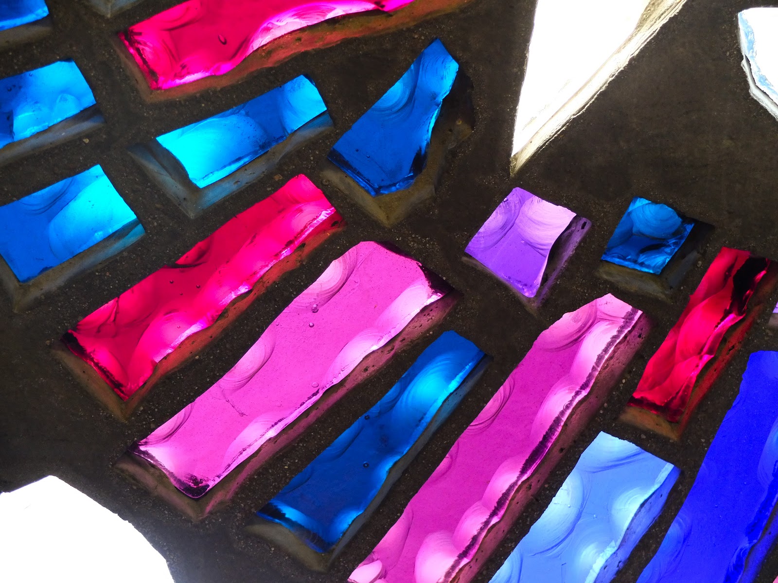

These stained glass windows are actually very difficult to photograph. Mr Strong Belief (who is a photographer) says it's because my camera struggles with white balance, because of so much intense colour. I fiddled with the colours of the photos to try and get it to represent the glorious reds in particular, they came out too orangey in my snaps- I'm not sure the colours are exact still, but still you get the idea.
Saturday Snapshot, is a wonderful weekly meme from at home with books
That is my kind of architecture, blocky and symmetrical :) Even though the colors may not be true to form, your stained glass photos are awesome!
ReplyDeleteI visited there almost 20 years ago, and had forgotten about the windows. They really are beautiful.
ReplyDeleteMy camera and I also struggle when the colors are too intense, it's always annoying when you see something stunningly beautiful and the camera won't render it properly :-)
You did a great job with these. The glass is beautiful.
ReplyDeleteI think they are beautiful! Imagine stained glass in a library.
ReplyDeleteOurs is plain as day.
The stained glass is lovely! Too bad about the 60s architecture, though.
ReplyDeleteI do love stained glass...in my house in the foothills, we had a window near the front door with stained glass. It was my favorite thing.
ReplyDeleteHere's MY SATURDAY SNAPSHOT
Stained glass is just so beautiful! I was always amazed, as a child, when we went to church. Going into church from the parking lot, the window in the sanctuary was nothing special to look at, but once our family climbed the stairs to the sanctuary and found our seats, I'd always spend the first few minutes marveling at Jesus the Shepherd dazzing everyone as the light passed into the room from outside.
ReplyDeleteThanks for such a wonderful memory! Your pictures took me back!
The stained glass shots are lovely!
ReplyDeleteI like the brochure view, otherwise yeah you are right.. it is blocky.
ReplyDeleteThe stained glass is beautiful!
ReplyDeleteThose jewel-like colours are beautiful! I like your second shot best, though. It looks like the Administration Building on a small, arid planet where the inhabitants don't have much time for frou-frou, architectural or otherwise.
ReplyDeleteBeautiful stained glass,even if the colors are exact!
ReplyDelete*smiles*
I think you did a great job with the stained glass -- photos are only copies and are never going to be exactly what we saw with our mind's eye.
ReplyDeleteGorgeous photos! Love the stained glass.
ReplyDeleteThe stained glass looks lovely. If you didn't tell us I wouldn't have thought the color is off. (I would love to see that exhibit)
ReplyDeleteMr. Strong Belief, I love it. Your photos are great, what is that black slug like thing in the tourist brochure, at the front of the building?
ReplyDeleteThe stained glass is gorgeous. What is that black thing lying in front of the library? Is it a giant tooth fossil? Here's Mine
ReplyDeleteOooh, I love the stained glass - they look like modern artworks. You could frame those photos.
ReplyDeleteI can't remember what the black slug thing is called. It's actually a metal sculpture.
ReplyDeleteI definitely prefer the second view of the building from afar. :) The stained glass looks beautiful though. It would be fun to listen to the music and look at it at the same time.
ReplyDeleteI can't believe you think the building is too 60s and blocky. I think it's one of the most beautiful buildings in Canberra - graceful, classic (literally and connotatively) and timeless.
ReplyDeleteBut as for colours, well. We find that often our cameras just won't pick up a certain deep pink - at all. I remember trying to photograph a bird in Kings Canyon (Watarrka) and it had a purple pink colour on it. The camera didn't pick it up at all. So frustrating. What does Mr Strong Belief say about that particular colour?
Ah Sue, I knew you'd be on to me.... I can see how you'd like it, but I don't really. In fact I think I don't really like many of the buildings down on the water there. And the parking is particularly terrible these days! Very unCanberra.
ReplyDeleteI'll have to ask him about particular pinks being frustrating. I've certainly never noticed anything like the trouble I had with these windows.
Oh the parking is a real problem ... not very unCanberra these days. Many of my lunch decisions are made based on parking,
ReplyDelete